National Geographic
National Geographic is an iconic brand. Wrapping the box in the yellow frame instantly adds recognizability and credibility to each of these products. After that, the primary goal is to create a fun, energetic cover image that quickly displays the excitement that this toy can create.


Work Sharp
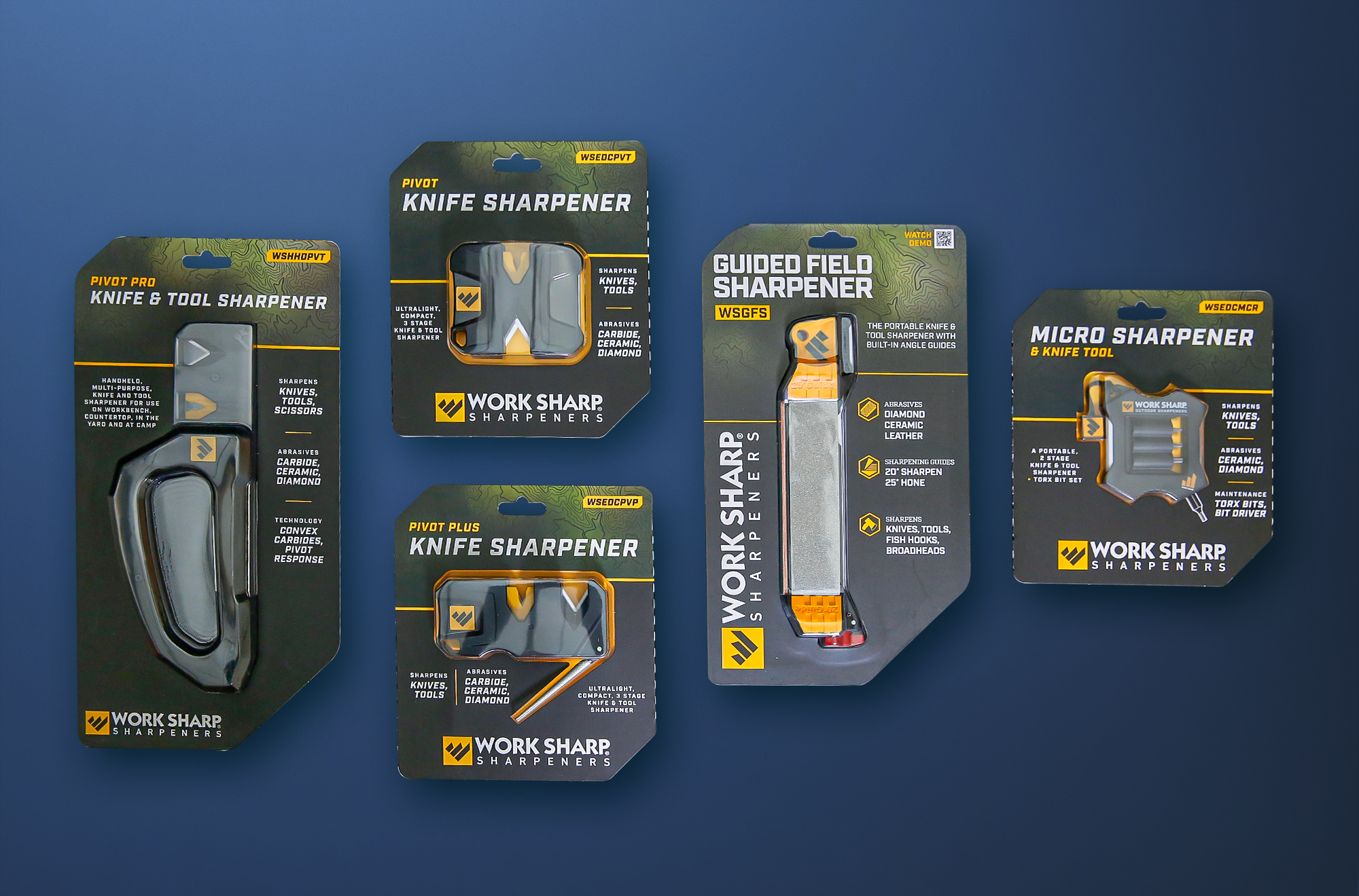
I had the privilege of building Work Sharp brand from the ground up. Packaging was one of the primary pillars of that identity. Each package displays a familial style, using strong typography and recurring brand elements aligned with the target customer. The messaging on the packaging quickly introduced the product, purpose, and outlined the benefits and differences between each product to allow customers to quickly find the right product for them. The slanted front panel was used to counter low shelf placement.


NASA
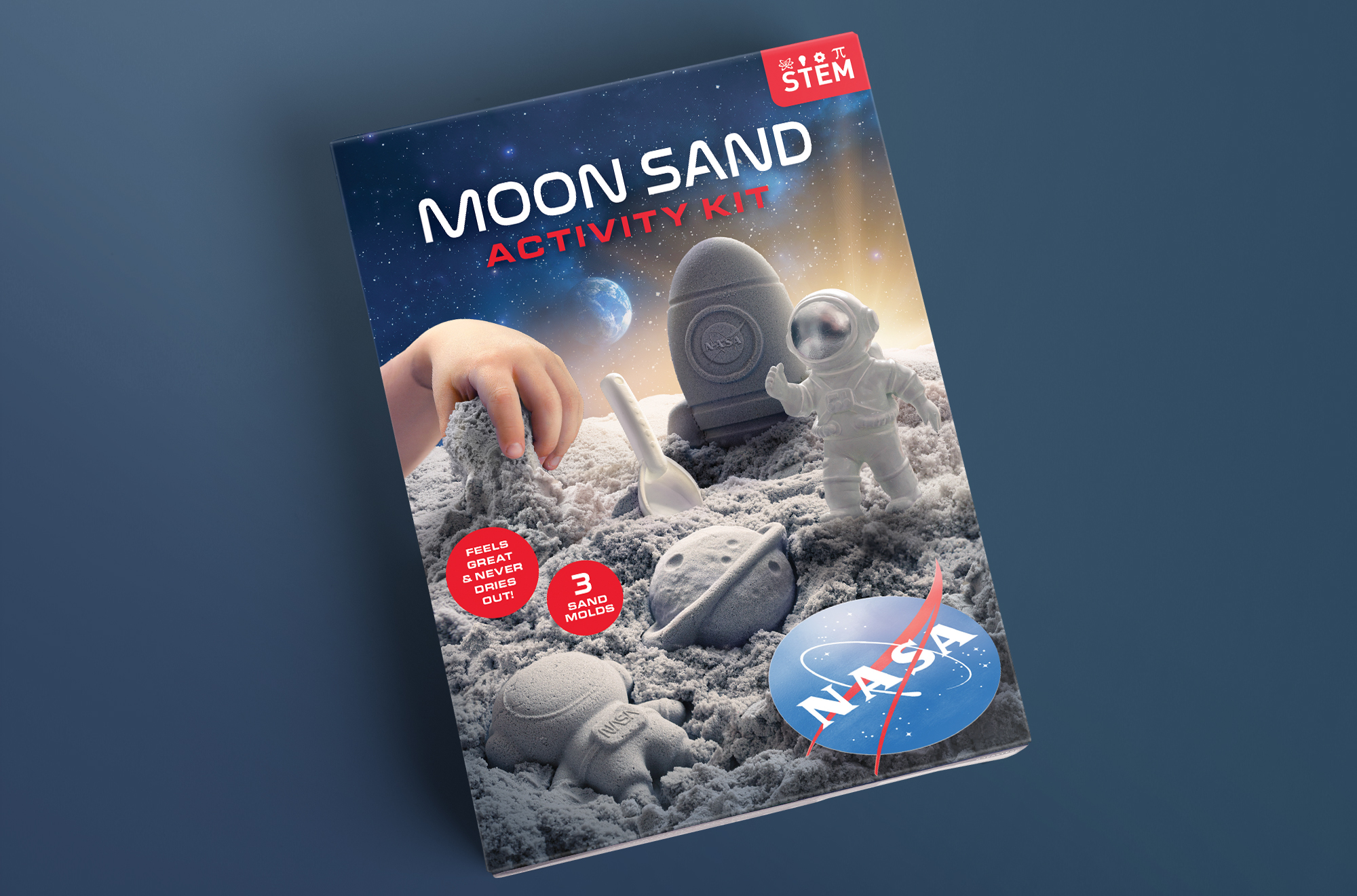
Similar to Nat Geo packaging, creating an exciting cover image is key. An added challenge is that NASA restricts use of it logo unless it is shown on the product. Luckily, this kit included a logo decal, allowing me to place it into the scene to tie into the brand.

Blockaroo
Blockaroo is a fun, tactile magnetic building block toy for toddlers. This package was created to be a reusable storage container. I designed the tab and graphics to look like playful treasure chest with the disposable outer wrap acting as a billboard to show the inside.


